JUTHUR RESIDENCE
Rooted in Belonging.
Brand Strategy · Visual Identity · Environmental Graphics · Brand Experience
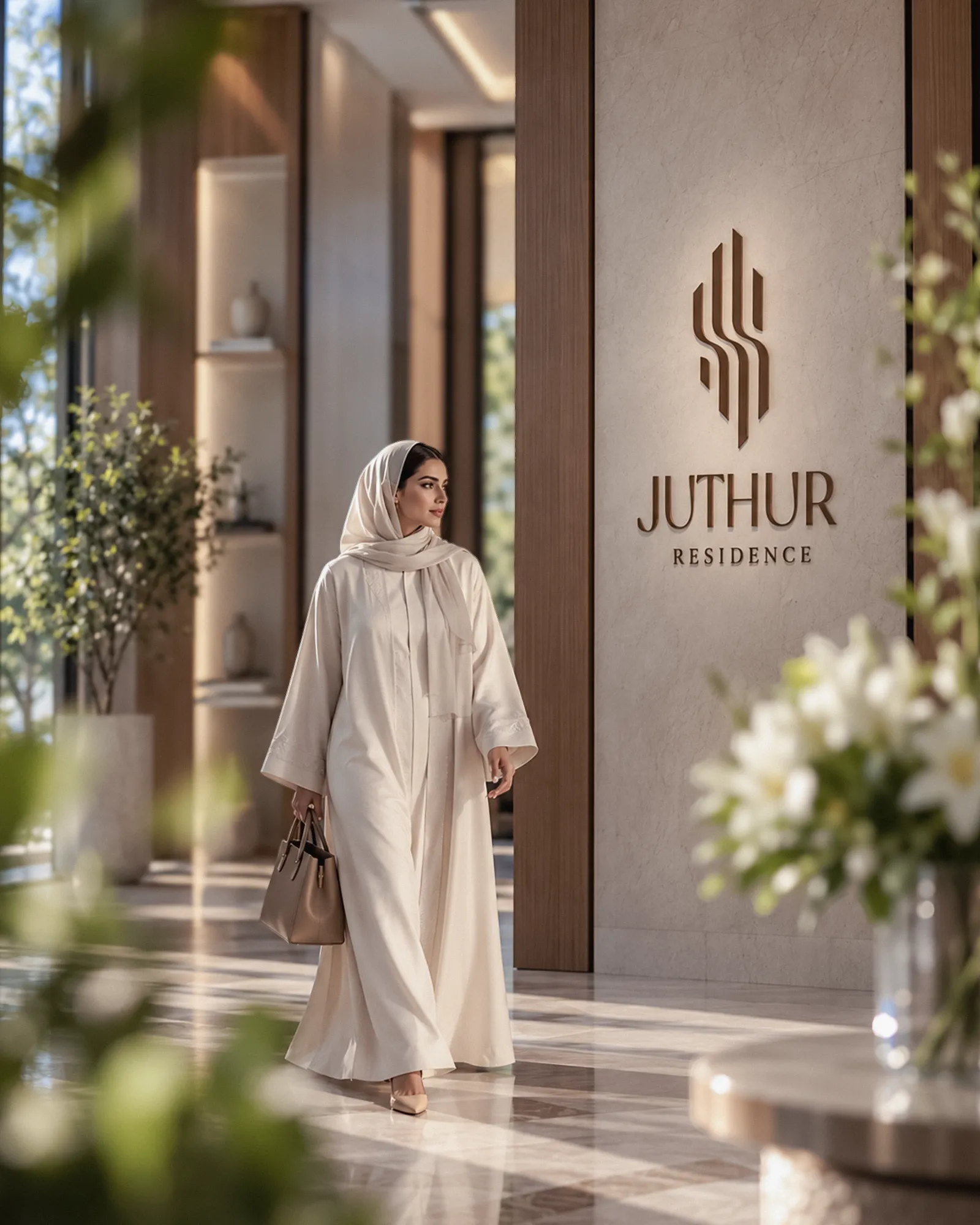
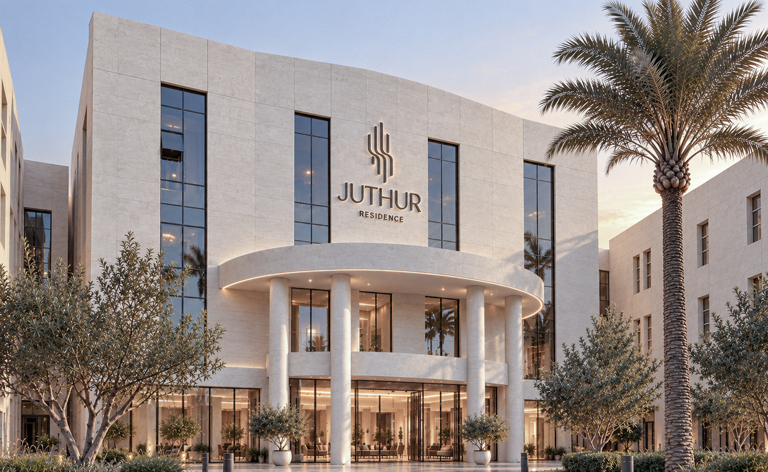
JUTHUR is a contemporary residential identity created for a renewed living experience in Riyadh, Saudi Arabia.
More than a visual transformation, the project establishes a cohesive brand language that connects architecture, identity, communication and everyday living.
JUTHUR RESIDENCE
THE CHALLENGE
A New Chapter for Residential Living.
An established residential community in Riyadh was entering a new phase of transformation, with renewed interiors, an evolving management direction and a refreshed approach to the residential experience.
The challenge extended beyond creating a new visual identity.
GRIFFINART was tasked with developing a distinct brand capable of reflecting this transformation, connecting the development's institutional heritage with a contemporary vision for residential living.
The result needed to feel established yet progressive, architectural yet human, and refined without losing its sense of warmth.
THE BRAND IDEA
Rooted in Belonging.
The name JUTHUR, meaning “roots” in Arabic, became the foundation of the brand.
Roots represent more than stability. They express a connection to place, continuity, familiarity and the feeling of belonging somewhere.
This idea shaped the identity around the relationship between architecture and human experience, bringing structure and warmth together through a single visual language.
THE SYMBOL
Architecture. Living. Roots.
The JUTHUR symbol brings together three interconnected ideas.
Together, the forms establish a distinctive identity that balances architectural precision with a human sense of warmth.
Structure / Evolution
Vertical forms express architecture, structure and stability.
Living / Comfort
A subtle central movement introduces softness, reflecting the comfort and flow of residential life.
Root / Authenticity
The lower extensions anchor the symbol, expressing grounding, continuity and belonging.
THE SYMBOL
FROM SYMBOL TO SYSTEM
THE SYMBOL
FROM SYMBOL TO SYSTEM
THE SYMBOL
FROM SYMBOL TO SYSTEM
THE VISUAL SYSTEM
One Form. Endless Possibilities.
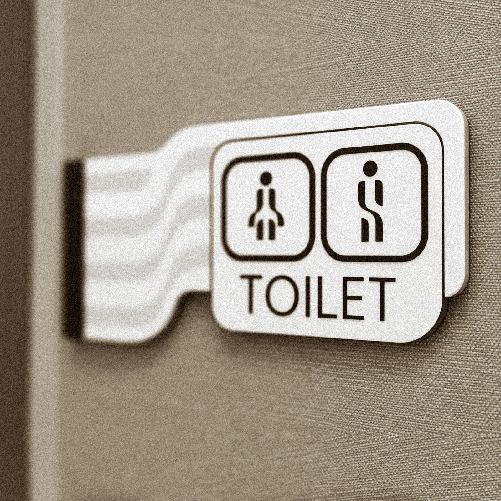
The defining curves of the JUTHUR symbol became the foundation of a broader visual language.
By extending its geometry into custom iconography, patterns and functional graphics, we created a cohesive identity designed to adapt across different scales, spaces and everyday interactions.

ENVIRONMENTAL GRAPHICS
An Identity That Guides.
The JUTHUR visual language extends beyond communication into the built environment.
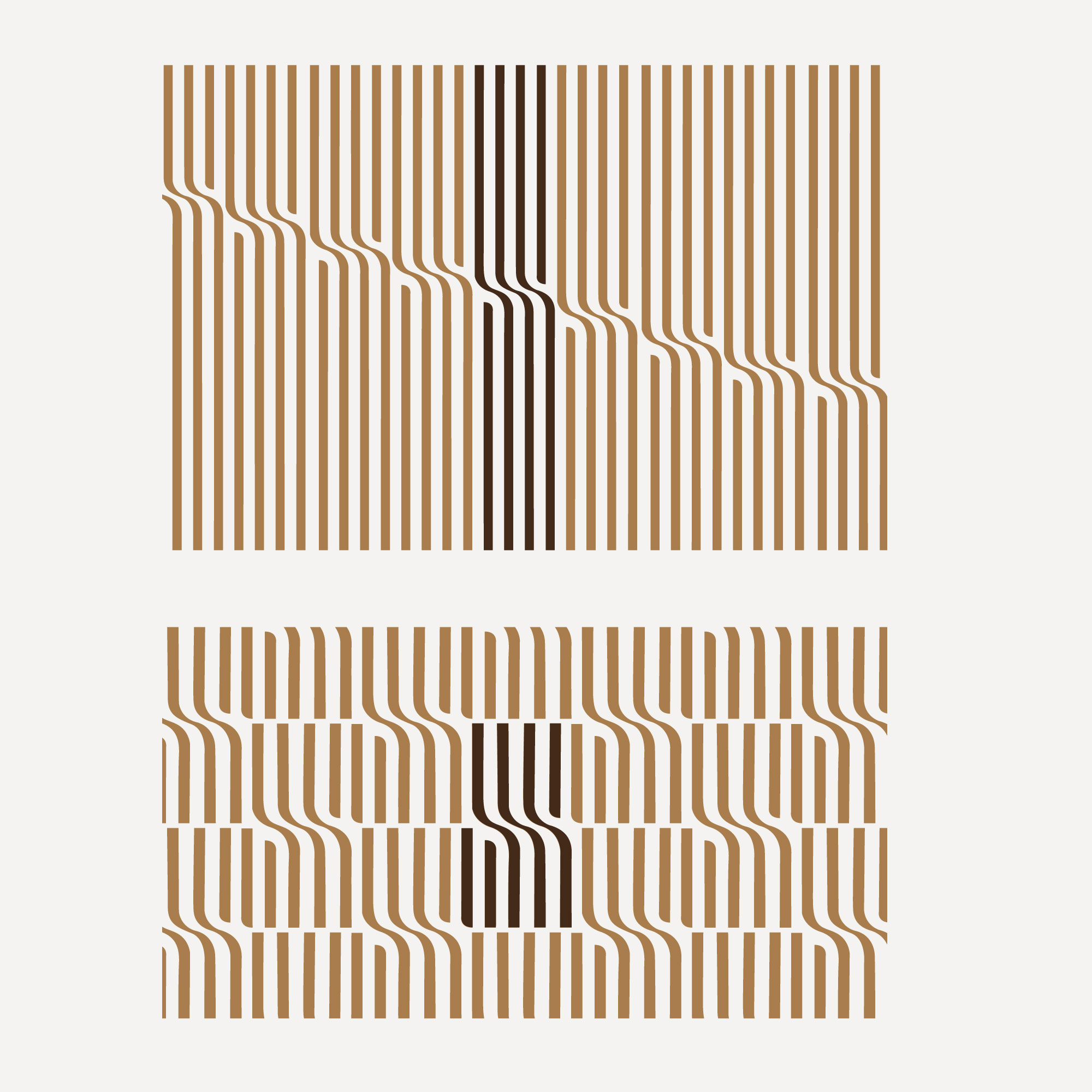
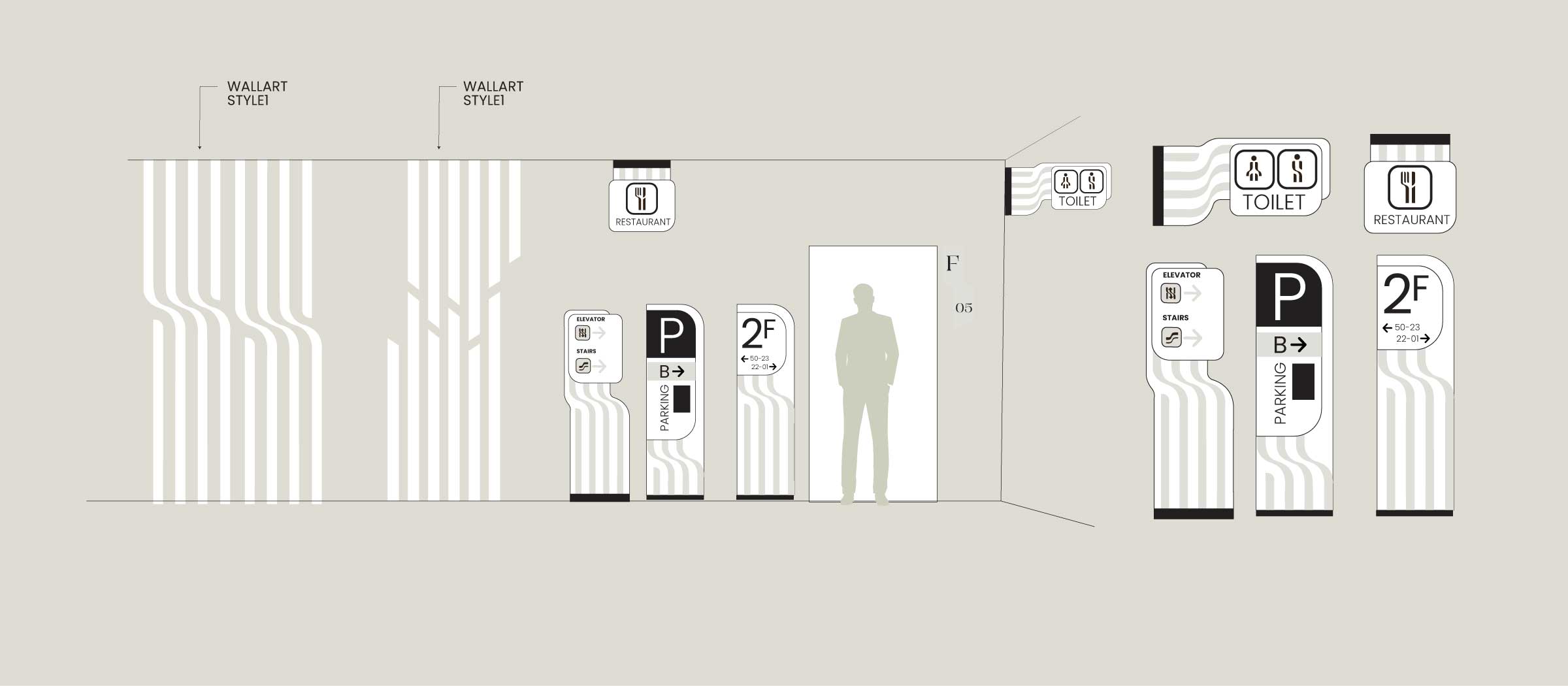
We developed a unified wayfinding and environmental graphics system using forms derived from the brand symbol.
From custom facility icons and directional signage to floor identification and architectural graphics, each element was designed to create a consistent and intuitive experience throughout the property.
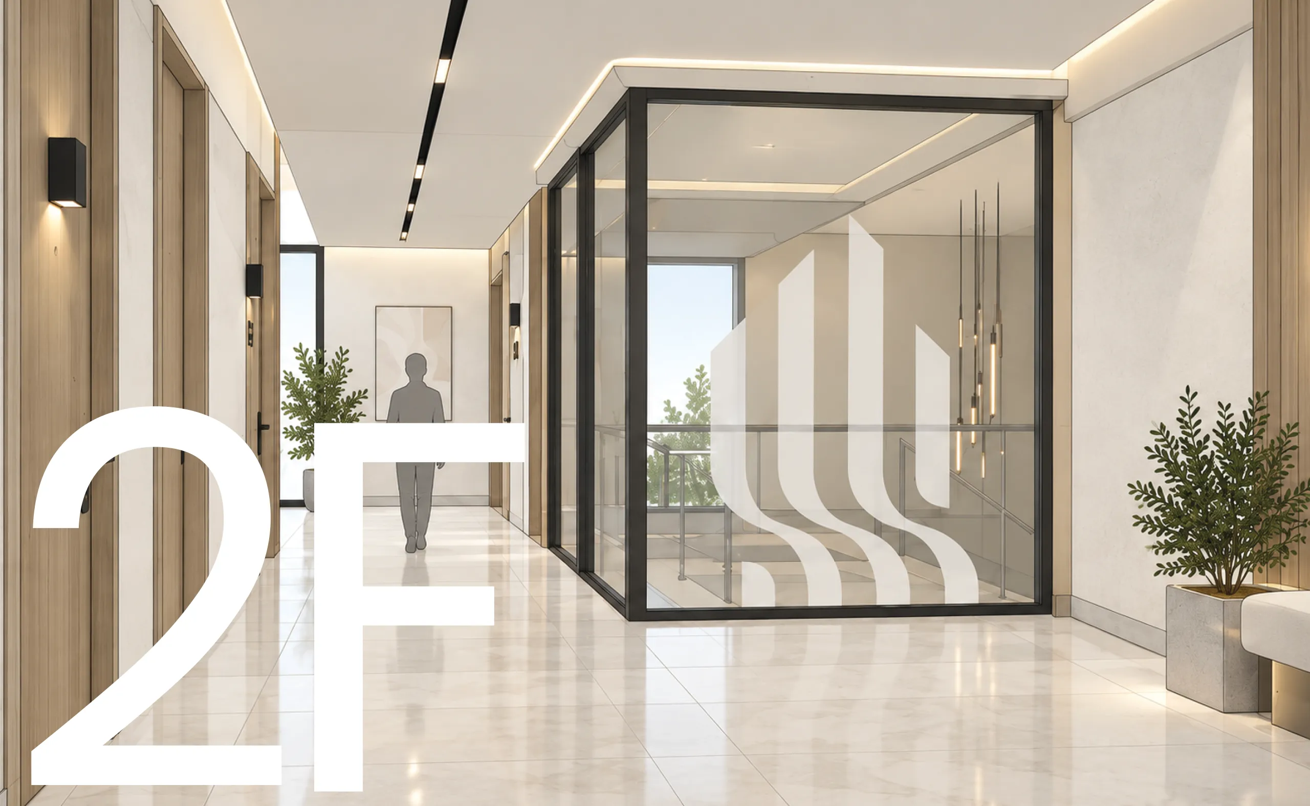
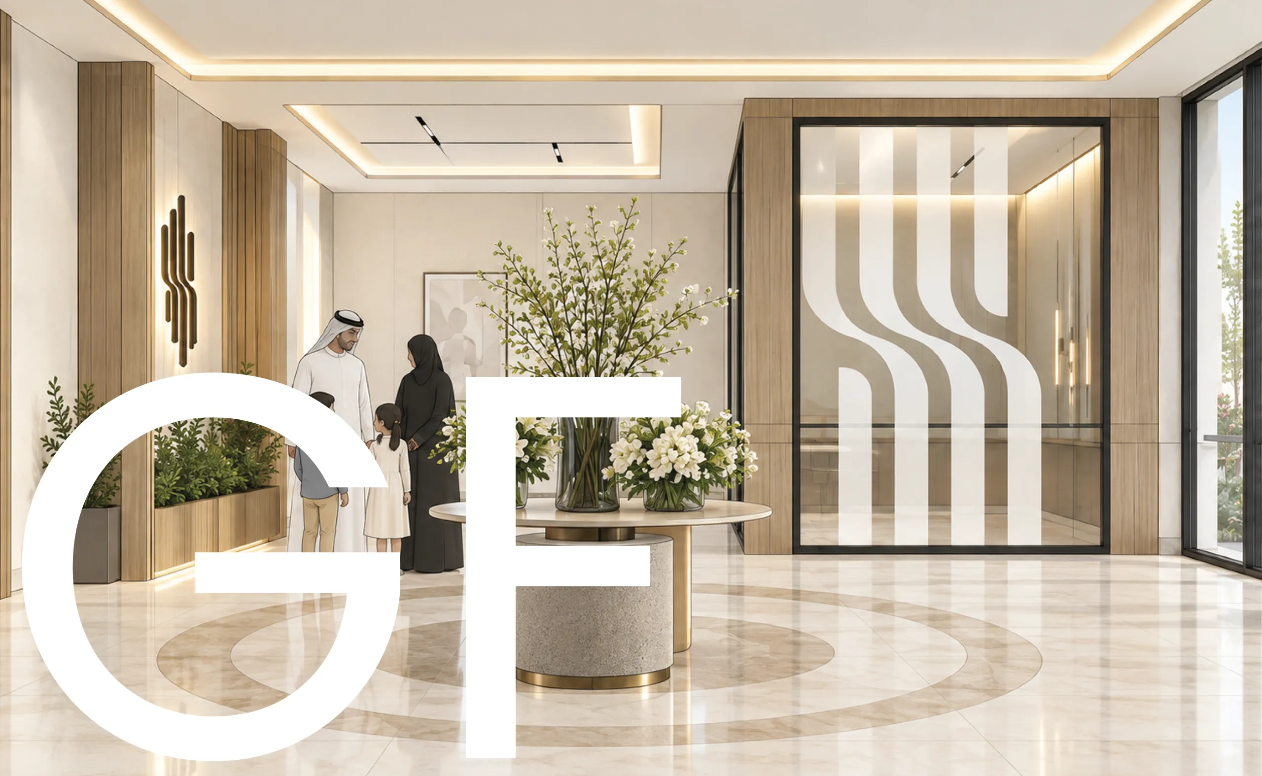
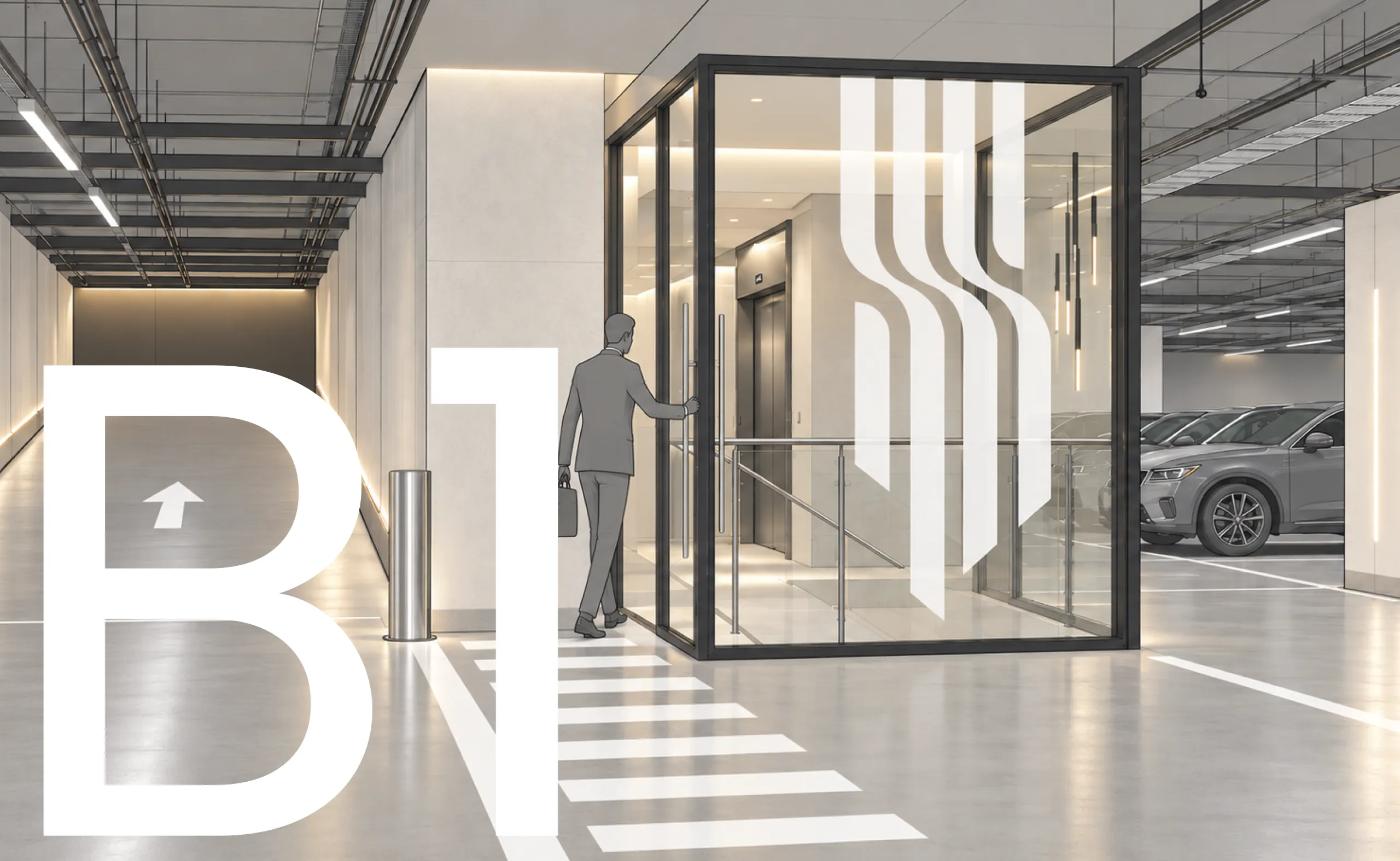
One Identity.
Three Spatial Expressions.
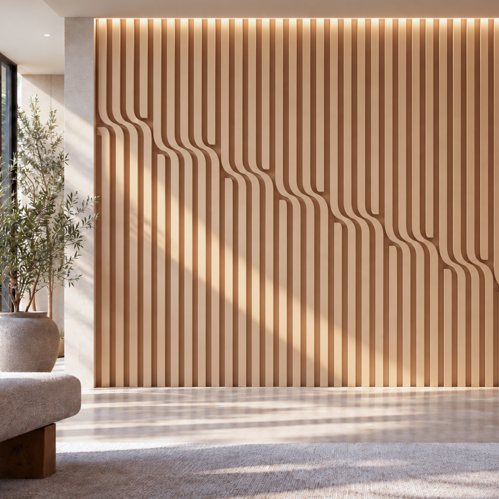
Rather than repeating the complete symbol across every surface, its defining forms were adapted to create distinct expressions throughout the building.
The upper structure informs the residential levels, the central movement becomes a defining feature of the lobby, and the lower extensions connect the identity to the parking environment.
Together, these applications transform the symbol into an architectural language that moves naturally through the property.
THE SYMBOL
FROM SYMBOL TO SYSTEM
ENVIRONMENTAL GRAPHICS
SERVICE & EVERYDAY EXPERIENCE
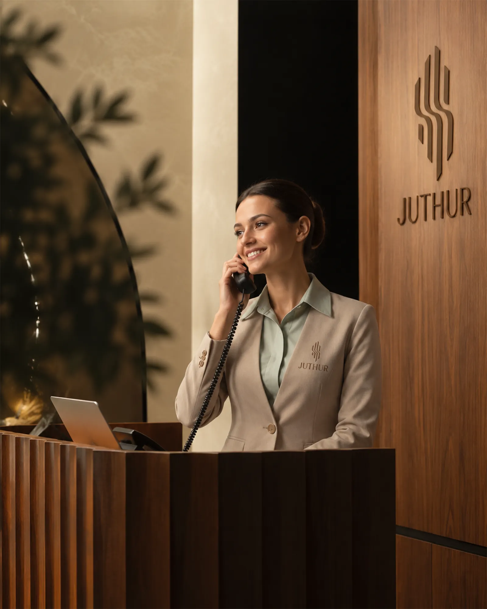
A residential identity is experienced through more than architecture or visual communication.
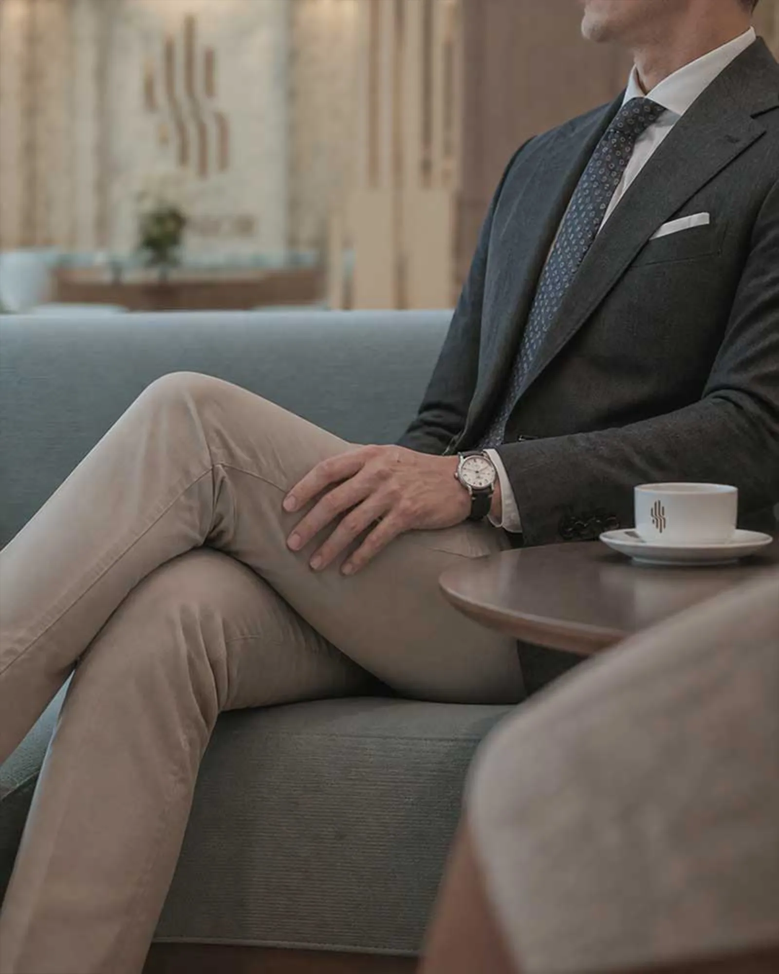
It is present in the moments that shape daily life, from the first welcome at reception to the smallest interactions within the property.
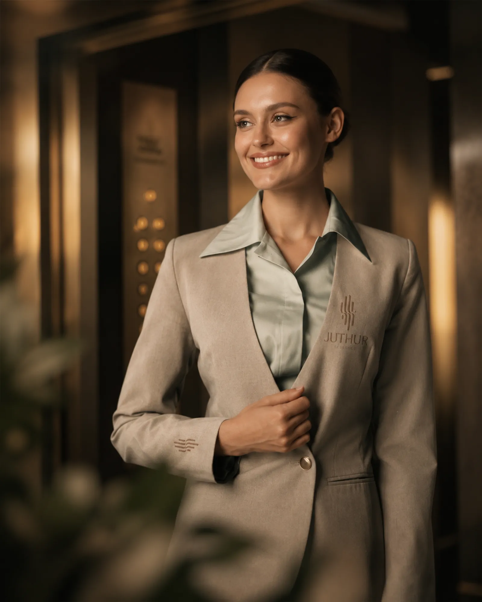
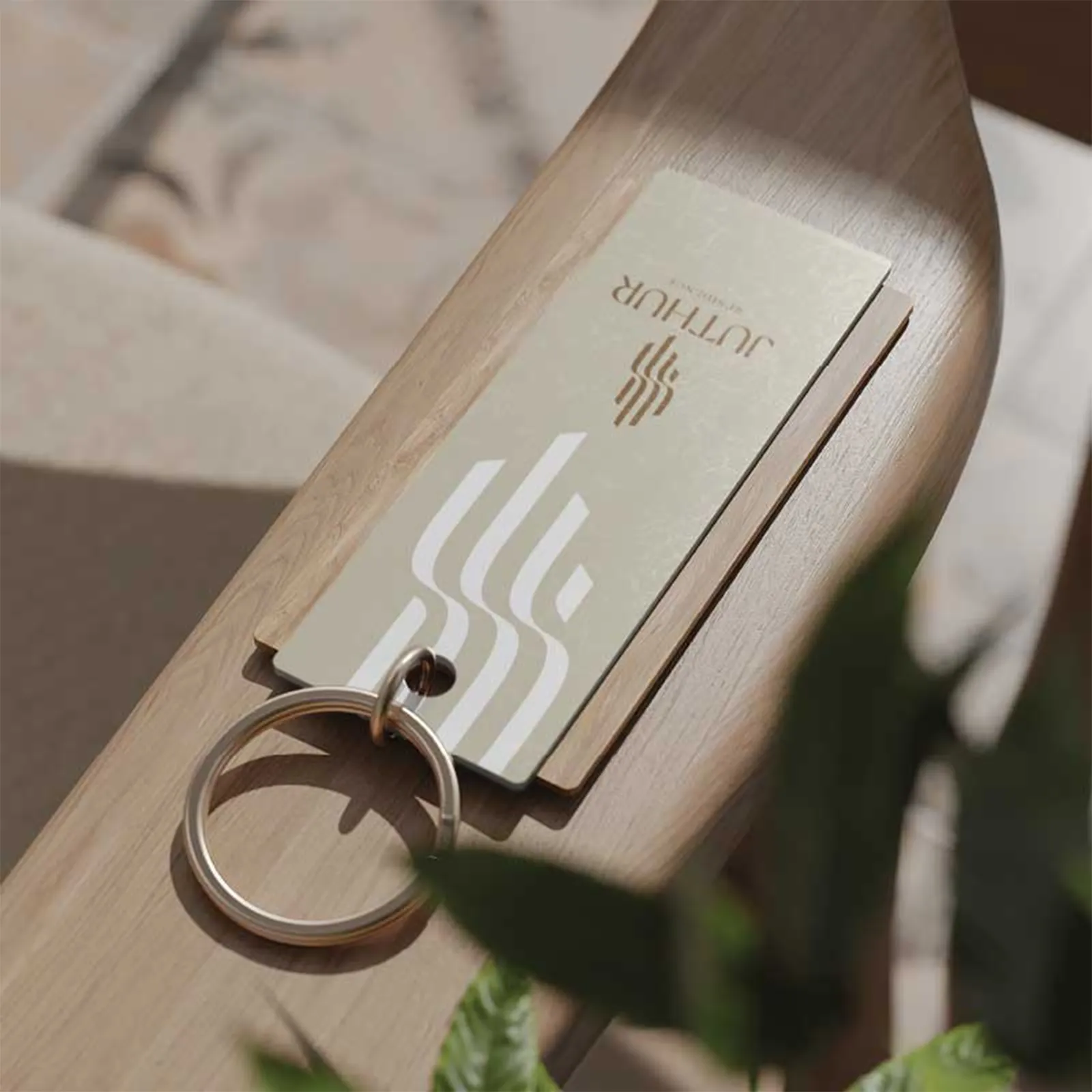
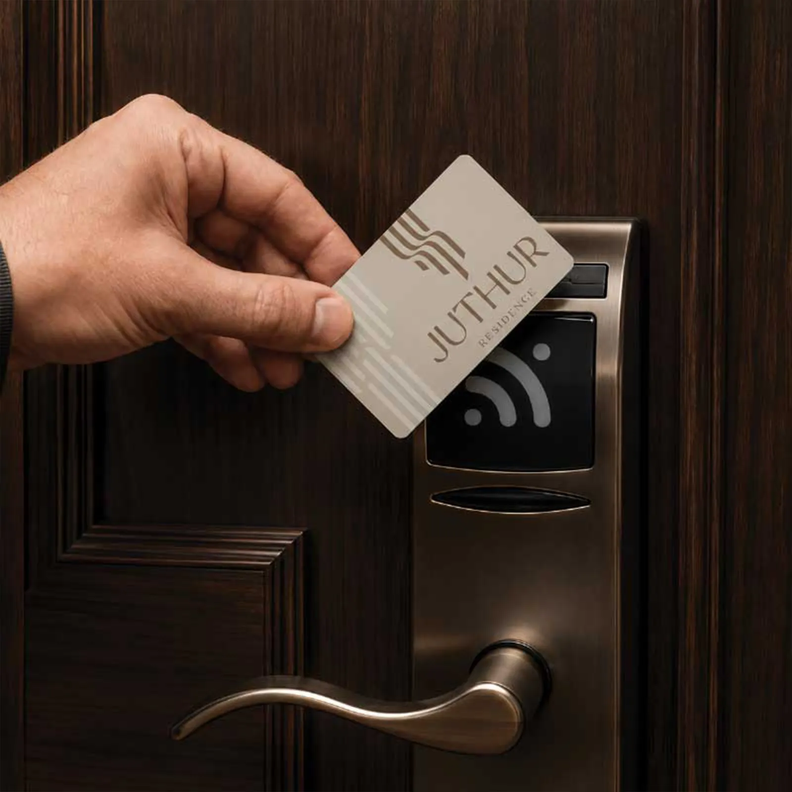
The JUTHUR identity was extended into staff uniforms, access cards, key tags and residential touchpoints, creating a consistent experience that remains recognizable without becoming intrusive.
THE SYMBOL
FROM SYMBOL TO SYSTEM
EVERYDAY LIVING
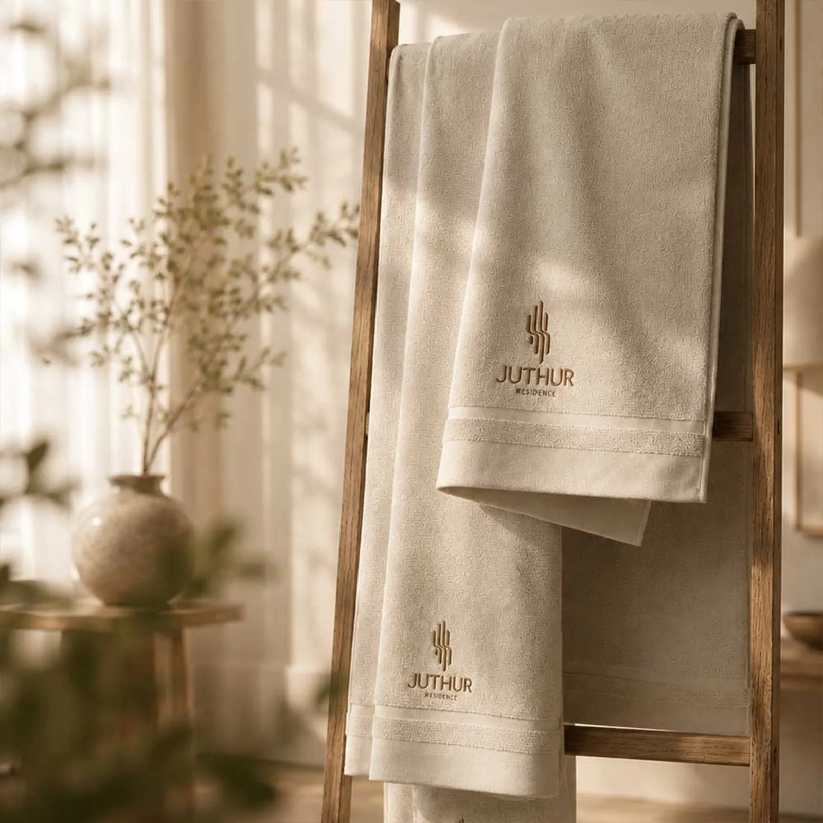
The Details Make a Place Feel Like Home.
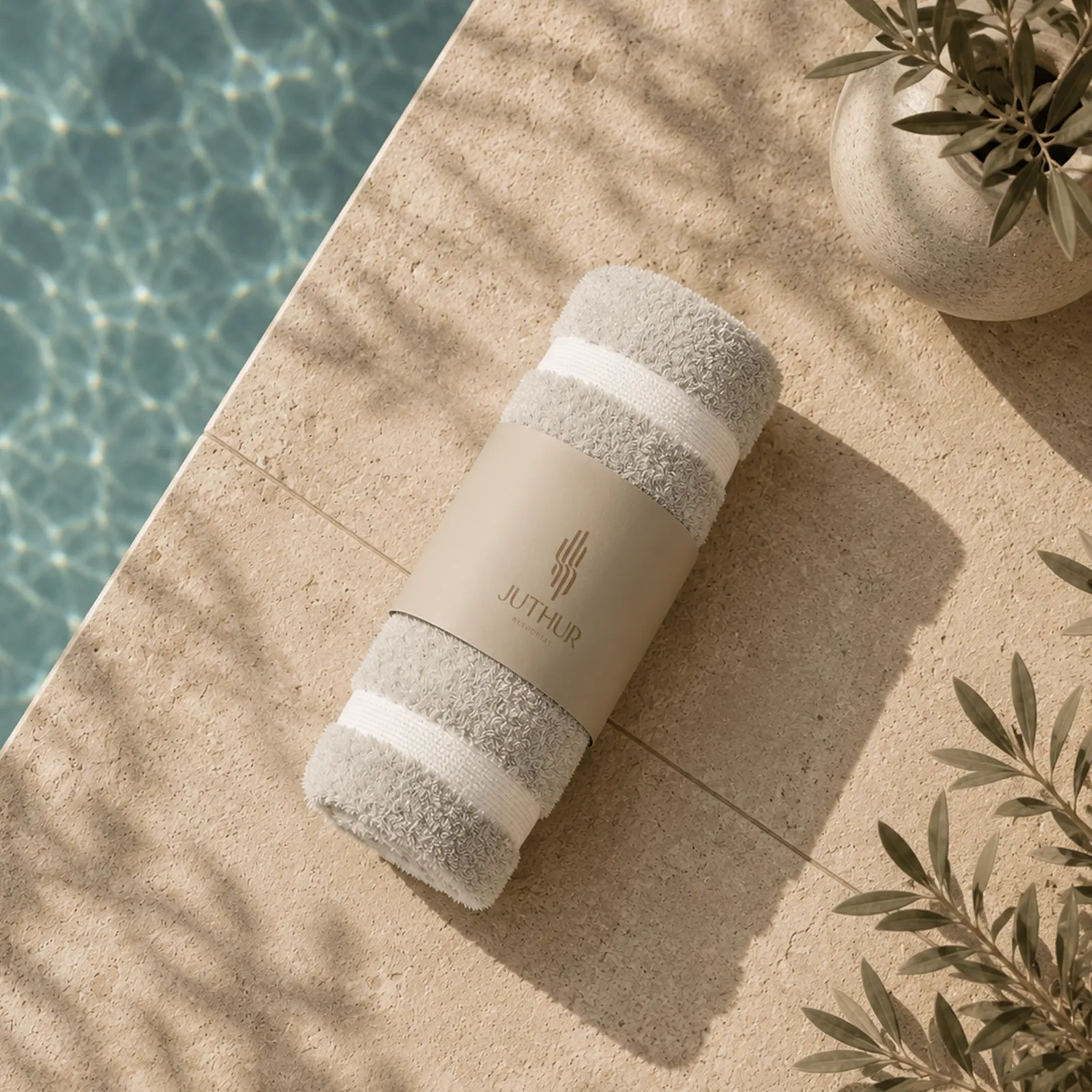
The brand extends into the everyday moments that define the residential experience.
From shared amenities and hospitality details to carefully considered personal touchpoints, the identity creates a sense of familiarity across different environments.
Every application reflects the same understated visual language, allowing JUTHUR to feel consistent, welcoming and connected to the place it represents.
BRAND COMMUNICATION
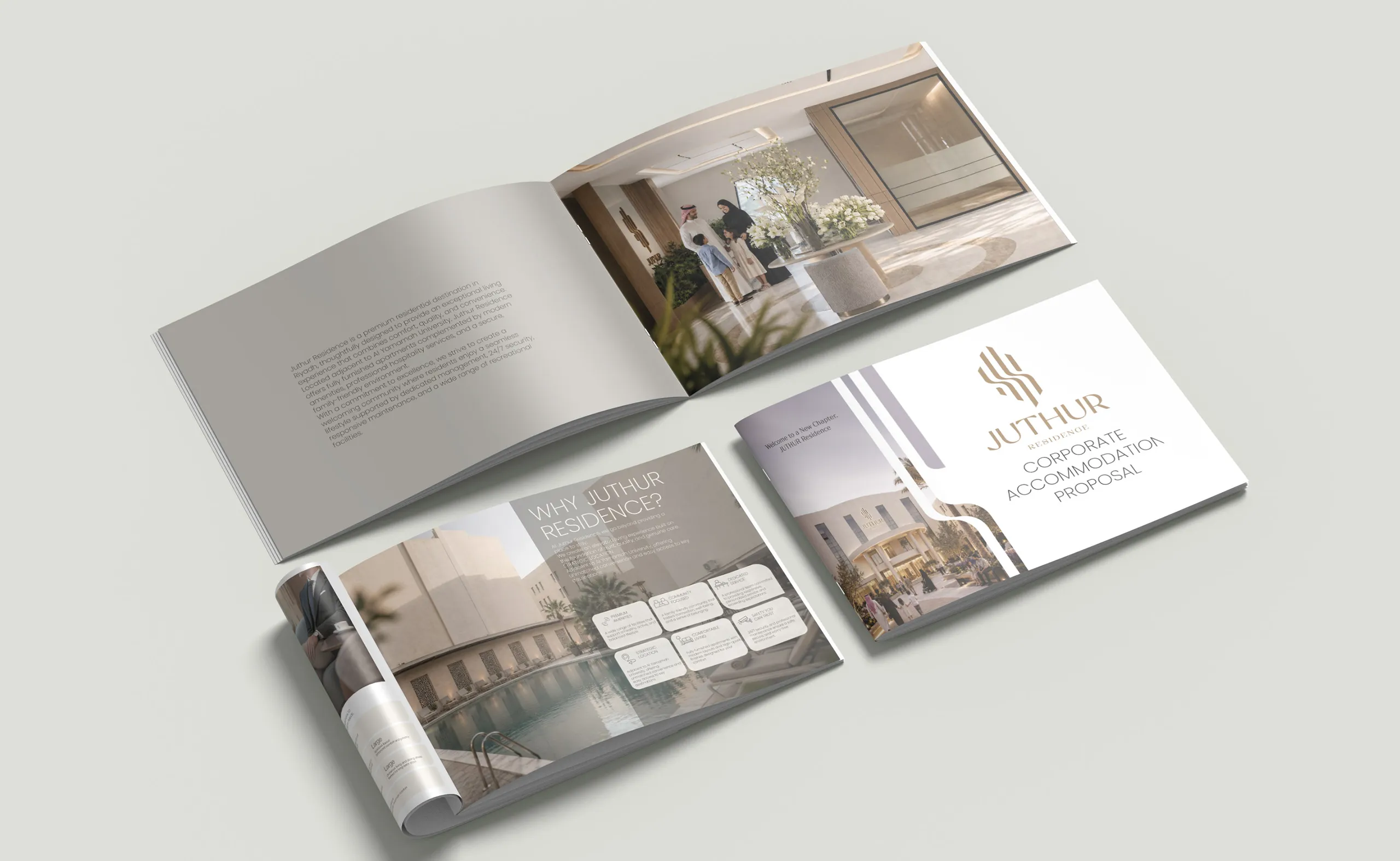
Designed to Communicate.
The identity was translated into a consistent communication system, extending the brand into residential and corporate accommodation materials.
Through typography, imagery and a restrained visual approach, the communication maintains the same architectural clarity and sense of warmth established across the wider identity.
THE LAUNCH CAMPAIGN
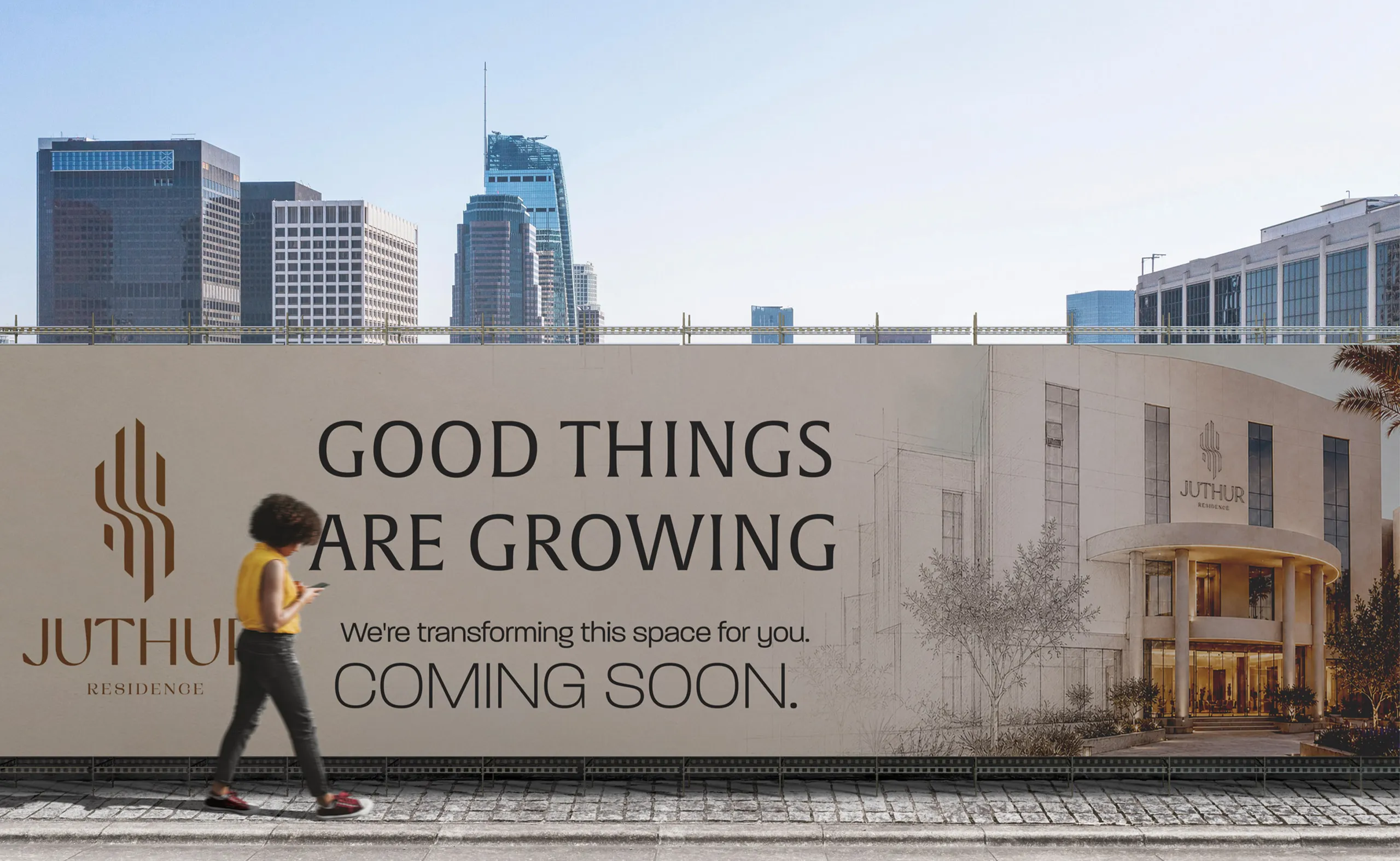
Good Things Are Growing.
To introduce JUTHUR's new identity, we developed a teaser campaign that brought the brand into Riyadh's urban landscape.
The campaign drew on the meaning behind the name, using growth as a metaphor for transformation and a new chapter taking shape.
Rather than relying on conventional real-estate messaging, the communication focused on anticipation, place and the promise of a renewed residential experience.
Good Things Are Growing became the central expression of this new beginning.
THE OUTCOME
From Identity to Experience.
JUTHUR was designed as more than a residential mark.
It is a cohesive identity system connecting strategy, architecture, navigation, communication and everyday living through one recognizable visual language.
From the smallest branded detail to large-scale environmental graphics and the outdoor launch campaign, every element was created to support a unified residential experience.
Rooted in Belonging.